Posts Tagged ‘illustration’

Getting To Know A New Friend…

Filed under: Illustration,Shanda's Journey,Sketchbook | April 17, 2013

Shanda McCloskey Illustration

I’m not sure if we could be great friends, but I want to get to know her better! She seems interesting, artsy, kind, considerate, and curious. I think she wonders about her future, her purpose, how to use her talents. We have so much in common!

Shanda McCloskey Illustration

Today, we met for coffee.
Tomorrow, who knows?!

Shanda McCloskey Illustration


Ruta Scared by Shanda McCloskey


Ruta Sweet by Shanda McCloskey

I like her.
I hope she likes me too.

-Shanda

Graffiti and A Chicken

Filed under: Illustration | February 12, 2013

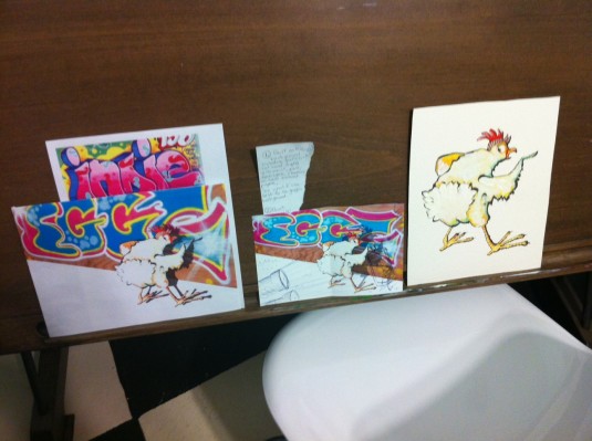
Chicken Scratch by Shanda McCloskey

Let’s face it, I’m a Georgia Peach. I like seeing trees, baby cows, and stars. I LOVE seeing the stars! But anyone who knows me well knows that a part of my heart belongs to Brooklyn, New York. I lived there with my husband and dog for a short year. What I miss the most is being in close proximity to other artists at every moment of every day. You breath it in. You eat it. You live it. Art seeps in.

I grew an admiration for graffiti there (especially in SoHo). It was more beautiful, skilled, and humorous than anything I’d seen in Atlanta. I thought about who those artists were. When did they create these masterpieces so no one would see them doing it? How did they get up there? Did they live these intense underground artist lives? Or were they just normal like me, and secret about it?

With that being said, its easy to see why I had the urge to illustrate a chicken writing graffiti, right? A clashing of my worlds :) I even wrote a story with this idea. It’s a work-in-progress still. But I wanted to share this illustration with you, because I think I’m headed in a decent direction with it. I would do several things differently on the next one, but I learned a lot from this. Here are my thoughts through it’s development…


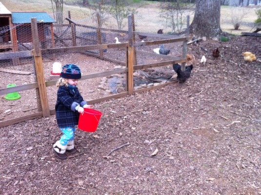
HJ feeding our neighbor's chickens.


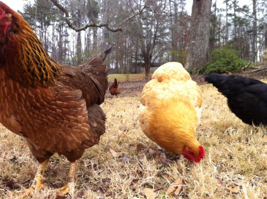
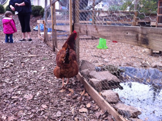
Every illustration starts off with a little research and play!


Brandie's Chickens

Lily and Chicken


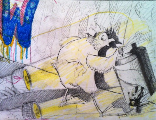
Then I sketch out my ideas. I did several before I finally decided on this sort of composition. I liked the trapped/caught moment and how it lets the graffiti play a large part of the picture.

Chicken Scratch Sketch


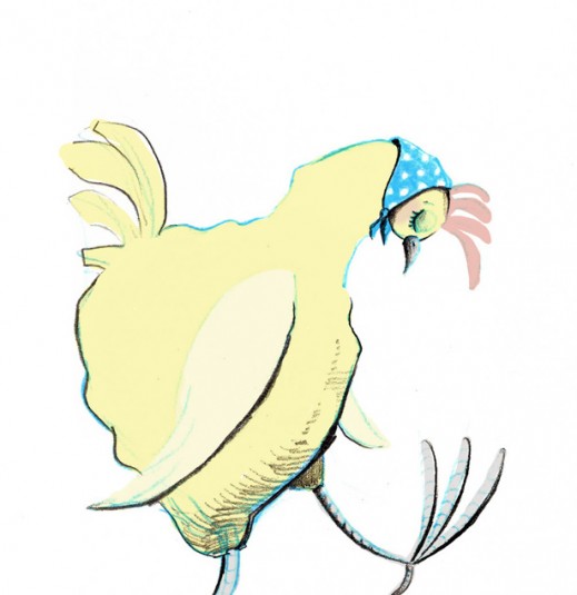
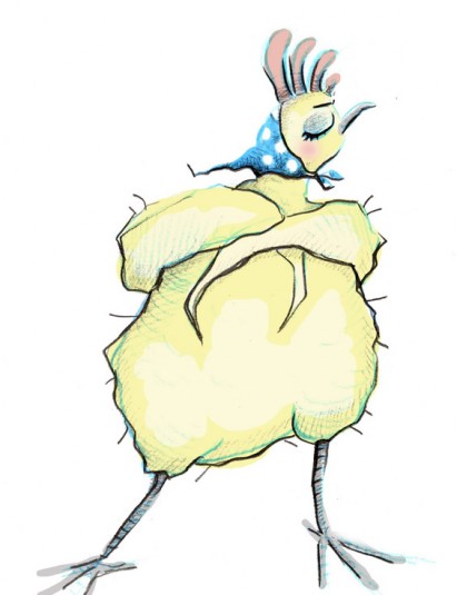
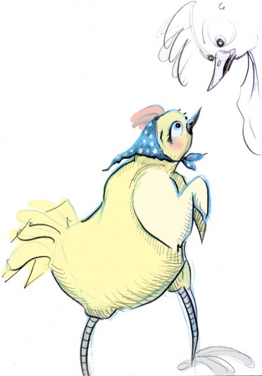
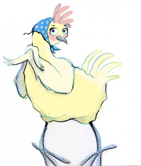
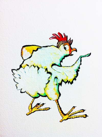
I had a work day and just wanted to work on the chicken character by itself. Here is my first draft. This chicken looks like a boy, and I didn’t like that. I wanted her to have a little artsy personality, so I added the bandana. All my chickens rock them.

1st chicken


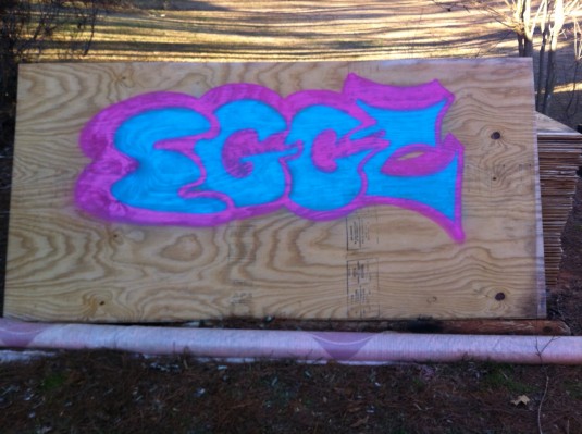
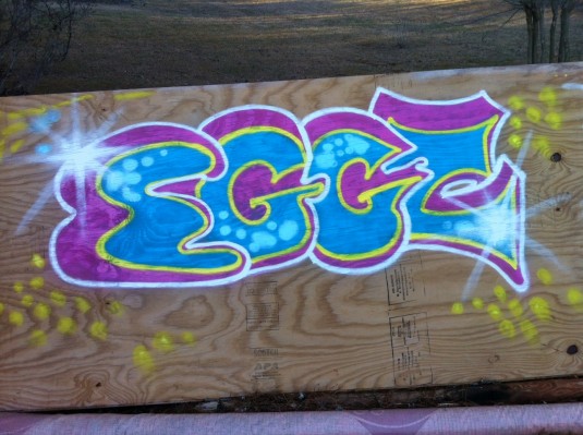
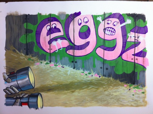
Then I did a lot of web research on writing graffiti. I learned about throw-up (quick bubble lettering), block buster (blocky lettering), and wild style (almost illegible/abstract lettering), and the best paint to use. I found Montana Gold spray paint easily at Dick Blick. It was pricey! But SO good. I tried my own (totally legal) below…

graffiti 1

graffiti 2


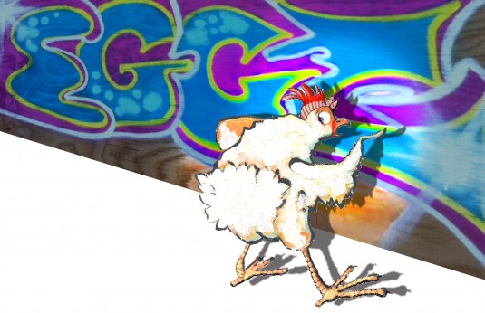
So then I took a photo and tried to combine this and my chicken character. The result was un-unified. They just didn’t mesh together (probably because I lack many Photoshop skills), and it also didn’t feel kid friendly to me…

draft of chicken and graffiti


I researched and found some lettering that inspired me more on a kid level.

Google kid graffiti

Google kid graffiti 2


I looked at Loren Long’s “Otis” for how he used muted colors for the backgrounds and black outlines throughout. He is also painterly, which I tend to admire.

Otis by Loren Long


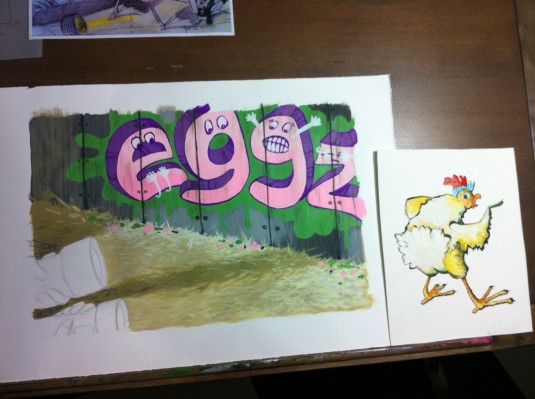
I painted a whole new background with brushes (instead of spray cans) for control.

new background


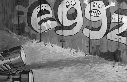
Too bright! So I took away the color and liked it better.

background black


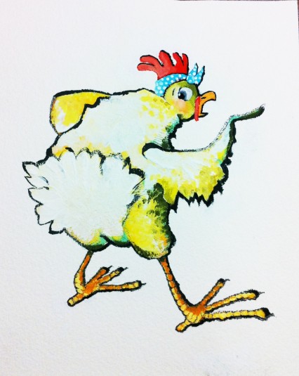
Then I worked on my chicken character again… Better, but still too bright. I like the primary color palette.

chicken character 2

muted chicken


Then I worked on piecing everything together digitally. I don’t care for that so much. I still feel that there is some disconnect in the picture (again, probably because I need to brush up on Photoshop skills). And lots of staring, thinking, tweaking, playing, changing, trying, undoing, muting colors…

desk 1

desk 2


And finally… Voila!

Chicken Scratch by Shanda McCloskey


Hope you enjoyed this post- the good, the bad, and the ugly :) -Shanda


BURST

Filed under: Illustration | September 19, 2012

20120919-002809.jpg

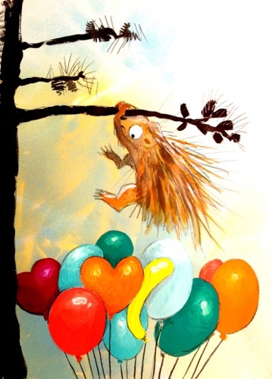
“Burst” inspired by Illustration Friday!

This is my second week to take about 20 minutes and get an idea down for the IF theme. It’s not polished. No impressing going on here- just gesture, concept, and story-telling!

A Peek at My Process: Little Red Riding Hoodie

Filed under: Illustration,Shanda's Journey | September 3, 2012
20120903-140907.jpg

This past weekend I attended my first “Illustrator’s Day” with the Southern Breeze SCBWI illustrators! It was just as amazing, if not better, than the pricier conferences (which are geared mainly to writers) that I go to twice a year. And as you can imagine, this day was geared specifically to illustrators. It was also extremely affordable. Anyway, more about Illustrator’s Day in my next post :)

I was fortunate enough to be one of the first 12 folks to sign up for Illustrator’s Day which qualified me to participate in a month-long mentorship with the amazing illustrator, Michael Austin! (He has a new book coming out soon called “Cowpoke Clyde and Dirty Dawg”.)

Michael challenged us 12 with depicting suspicion in the context of one of these three classic stories: Rumpelstiltskin, Three Billy Goats Gruff, or Little Red Riding Hood. We discussed sketches over email and phone calls. Michael Austin truly has a teaching spirit! His emails were very detailed, and he really took his time with each of us. I learned a lot! He says there are three things in which he feels is most important in an illustration: action, emotion, and connectedness.

So here is a series of photos of my work progressing from sketches to a final painting…

20120903-141004.jpg
These thumbnail sketches let me explore my options a bit. To see what floated my boat.
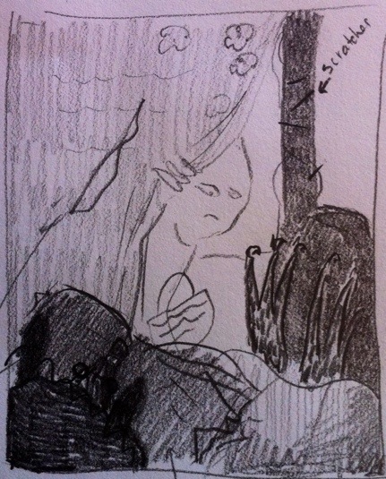
 

20120903-141058.jpg
I took to this one right away. Something about that curtain was very suspicious to me- which was the goal!
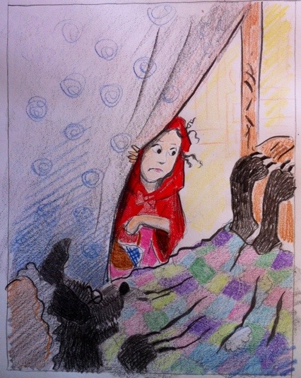
 

20120903-141116.jpg
I developed the sketch more so I could send it to Michael and he would have a clear idea of what I was going for. This sketch still has Red in her classic hooded garb.
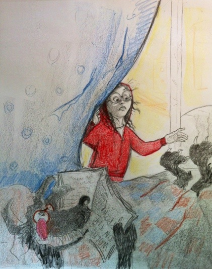
 

20120903-141129.jpg
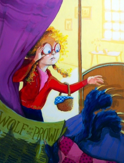
I was growing tired of Red Riding Hood cloak imagery, so I tried a hoodie instead. Michael challenged me to enhance the action and emotion. So, I let her hand reach to touch the wolf’s feet and she looks more scared. The wolf’s feet are about to pounce too. I also added glasses to Red. Michael brought up the question: why can’t Red tell this isn’t her granny until it’s too late?
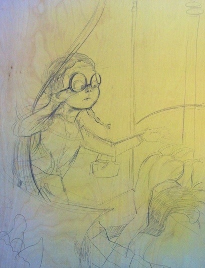
 

20120903-141149.jpg
At this point I just jump in. For some reason, I have the urge to paint on wood lately, so I did :) This sketch really got me excited. In some ways I like Red’s face and expression in this sketch better than in the final piece, but sometimes you just have to move along. And since I’m not a digital painter, I can’t just go back. What’s done is done for the most part. The mouth, eyes, glasses, and gesture in general is strongest here, but I’m still happy with my finished piece.
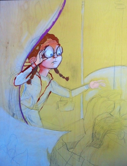
 

20120903-141207.jpg
I start adding paint. Unfortunately, things start looking a bit stiff here. And she starts to look older again after I had finally gotten her to look younger in the sketch above. The work sat like this for two days, and it itched at me bad- all I could think about was how I could “fix it”.
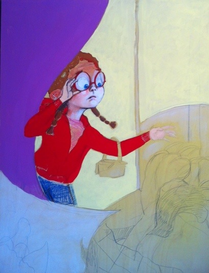
 

20120903-141230.jpg
Finally I got some time to myself again to paint. I was happy when I got it to this point. I think she looks younger again. And I was loving the purple drape!
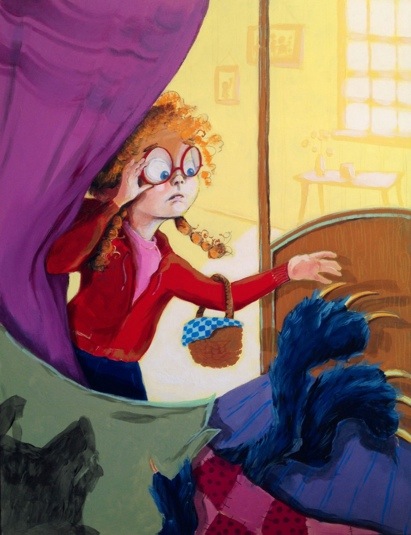
 

20120903-141249.jpg
This is a big jump in the process, but when you get on a roll you just have to go with it. I’m especially proud of the way the background turned out. I tend to avoid backgrounds so this was a huge leap for me to do one effectively that didn’t compete with my foreground images. Tints and shades. Tints and shades.


20120903-141304.jpg
On the last day, I pump up the contrast in several areas such as the hands, hair, and basket. I also completed the newspaper and made the wolf’s head’s shadow more transparent and a different shape.

So there you have it! I think it turned out pretty fun! This piece is a little more child accessible than some of my other work. I’m definitely evolving, growing, learning.  If you have a chance I’d love to hear what you think!


« Newer Posts

Shanda McCloskey, Children's Illustrator & Author