Illustration

Lesson #4: Attempt Being Friends with Technology

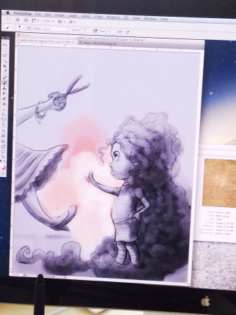
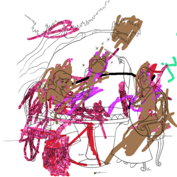
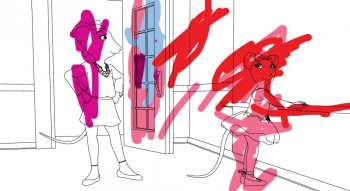
Work in progress… painting in Photoshop.

Work in progress. Painting in Photoshop on screen.

Work in progress. Painting in Photoshop on screen.

I’ve felt in my gut for a while that I needed to learn some more computer art skills. I already have a good foundation knowledge of Photoshop and I use it often to enhance photos for the  blogs and websites that I help with. Up until now, I’ve only used Photoshop to brighten my artwork before printing it or posting it.  CREATING with it is over my head. But… I took a little course called “Digital Painting in Photoshop” by illustrator Will Terry. He is a great teacher, and this course has eased my concerns so much. I’ve just started my first digital illustration painting in the style that Mr. Terry demonstrates. I literally just started, so… stay tuned- I’ll post my progress :)

I am aware that the competition in children’s illustration is fierce. There are so many really talented folks sending out to the same publishers and agents that I am. So, I feel I can’t be a stranger to the technology that could potentially help me work FASTER to create MORE work for my portfolio. The more I create, the better I will become. Also, I think it’s increasingly more appealing to work with artists who are technically-able, even if just for scanning and sending high res images over the internets :)

My Ben snagged me a Wacom Tablet for my birthday, so I could really give this a fair shot. I must say, I really like it! I would have bet money on me mostly hating it, and that I would have to force myself to use it. But I found that it’s easier! That’s all I need.

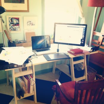
Computers in the studio

Computers in the studio

My almost 3-year-old embraced digital painting before I did, so I’m already behind…


photo 4

Thanks for stopping by!

-Shanda


Illustration Friday: Liquid (and other art on the beach!)

Filed under: Growing Up Artsy,Illustration,Sketchbook | May 23, 2013

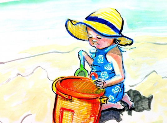
Abby on the Beach

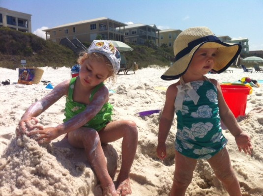
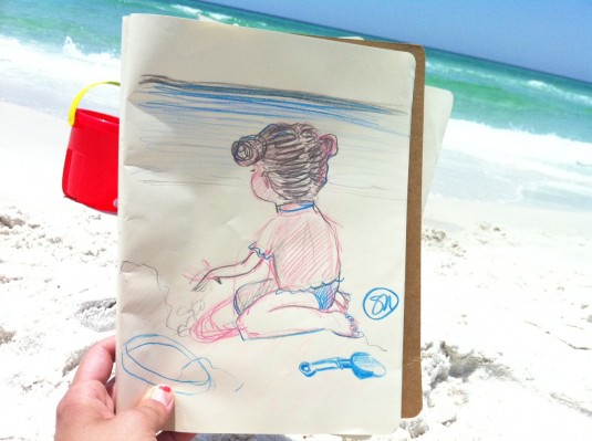
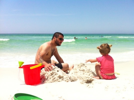
Just got back last night from a wonderful beach getaway! We went with friends who also had a precious little girl :) These beach beauties were my muse this week! And perfectly fitting for the latest Illustration Friday prompt: liquid. We played in or beside liquid all week!

beach pic 1

HJ beach drawing

Beach pic 2

beach pic 3

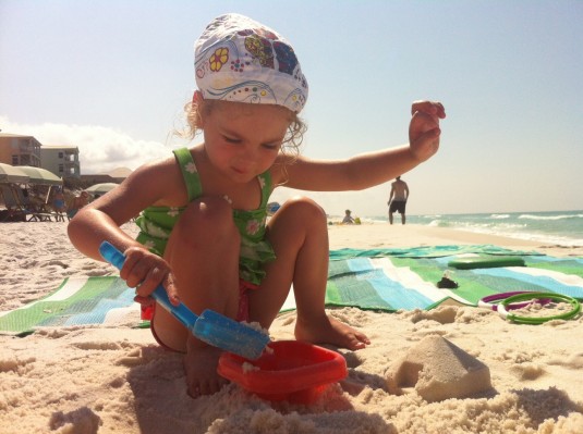
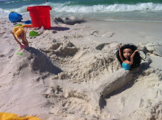
HJ got really good at sand sculpting during our stay.

sand mermaid

And so did I… I present my greatest beach masterpiece: “The Princess and the Mermaid”!


Ha! -Shanda

Loosening Up To A Little PINK…

Filed under: Illustration,On My Mind,Shanda's Journey,Sketchbook | April 27, 2013

Miss Featherbottom Sings by Shanda McCloskey“Just give me a reason
Just a little bit’s enough
Just a second we’re not broken just bent
And we can learn to love again
It’s in the stars
It’s been written in the scars on our hearts
That we’re not broken just bent
And we can learn to love again”


Miss Featherbottom Not So Sure by Shanda McCloskey

We Shared Chocolate Today…

Filed under: Illustration,Shanda's Journey | April 24, 2013

Ruta and Miss Featherbottom illustration by Shanda McCloskey


I’m continuing to get to know a new friend- we shared dark chocolate today. You can get right down to the nitty gritty when chocolate is involved! I told her about how I was actually timid to meet up with her again today… what if it didn’t go as well as last time? My spirit can be fragile! But I had nothing to worry about. She shared some of the road blocks she has come in contact with lately that get in the way of her goals too. She really put me at ease and encouraged me. She’s so cool.

Ruta Painting by Shanda McCloskey


-Shanda

Getting To Know A New Friend…

Filed under: Illustration,Shanda's Journey,Sketchbook | April 17, 2013

Shanda McCloskey Illustration

I’m not sure if we could be great friends, but I want to get to know her better! She seems interesting, artsy, kind, considerate, and curious. I think she wonders about her future, her purpose, how to use her talents. We have so much in common!

Shanda McCloskey Illustration

Today, we met for coffee.
Tomorrow, who knows?!

Shanda McCloskey Illustration


Ruta Scared by Shanda McCloskey


Ruta Sweet by Shanda McCloskey

I like her.
I hope she likes me too.

-Shanda

Notes To Self from Springmingle 2013

Space Chicken Illustration by Shanda McCloskey

Time flies! It has almost been a month since Illustrator’s Day and Springmingle and I’m just now getting around to writing up this post. I took notes for myself and wanted to document the highlights… and the gist of the weekend.

First of all, it was extra fun because I attended with 4 other members of my super critique group! There was definitely something special about our being there together. As each one of us went into the hall for our formal critiques, the others waited in the lobby as if the one being critiqued was in surgery or something. We all came out with good feedback, yet much to work on. I had 2 critiques in a row, because I did a portfolio critique as well as my first manuscript critique! My manuscript was reviewed by Jill Corcoran, an agent with the Herman Agency. She is very straightforward, but kind. She saw a few of my illustrations too so she saw me as a whole package as someone trying to write and illustrate, and do you know what she told me…?

She said (twice by the way), “You have a future in this. Keep working at it.”

Holy cow! That was nice to hear :) It was like she said: You’re not crazy for spending countless hours following this dream. You are getting closer. She didn’t say those words, but I think that’s what she meant :) Of course that MADE my weekend! And yes, I cried when I got back to my critique group. That’s just who I am :)

critique_group_shot

It was also cool to spend some time with my illustrator buddies too! These girls (Shannon and Christina) are really down to earth and talented. We represent 3 states! We don’t see each other often, but it sure is nice to talk art when we do.
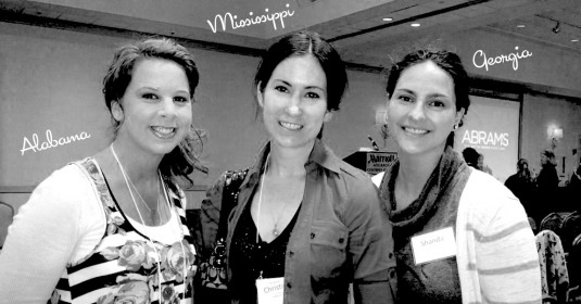
artists_group copy

These are just two of the many amazing illustrators I have come to be friends with. I could never list them all, but each one has taught me something different! Lori Nichols, for example, has given me incredible, forehead slapping Photoshop tips and an beautiful example of a mother-of-three living this dream! The openness and honesty of Kristen ApplebeePrescott HillAlison Hertz, and Elizabeth Dulemba‘s journeys are dear to my heart as well. Thanks for all you do and for sharing what you know with me.

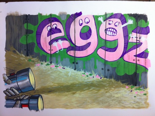
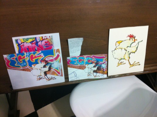
Since I was one of the first 12 to sign up for Illustrator’s Day, I was able to participate in the assignment art directed by Mark Braught! Here are some sketches and the final, although I feel it got too busy. And I prefer the cropped vignette image at the top of this post best :)
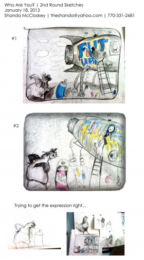
Shanda McCloskey Sketches

Chicken Graffiti by Shanda McCloskey

The weekend started with Illustrator’s Day (just for artists) with the silly Chad Beckerman (Abrams Creative Director), the hilariously honest Will Terry (Professional Illustrator), and the genuine, Dianne Hess (Scholastic Press Executive Editor).

Chad said that postcards are a pretty good, efficient way to send art samples to him. He also has been finding illustrators on Instagram! His big message was to get away from the idea that your work is “precious.” Because that way of thinking stifles you from changing and exploring as deeply as we need to as illustrators. Stay loose, free, full of life! Not, museum precious.

Will hit us with tons of graphs and charts about the market, reality, and moving forward. His big message was to be an illustrator entrepreneur. Do all the things we need to do to get traditionally published, there’s nothing like it, but ALSO do your own thing. That may mean apps, quality self-publishing, editorial art, other art forms, etc. To make it as an illustrator for a career, we must DO BOTH (traditional and our own thing). That was nice to hear, because I would love to try a few apps with my husband :) What if I could bring in some income from an app… what if? My dad would love this guy! He’s always telling me… “why don’t you just make your own books?”

Will’s recipe to be successful on your own:

1. Perfect your craft. Know who you are. (Working on that.)
2. Build a microphone. Blog! (Doing that right now!)
3. Develop a good idea.
4. Make a product that is amazingly _________. If you have a computer, you have a factory.
5. Tell the world. Blog, submit to review sites, etc.
6. Never quit, commit for life.

Then Springmingle heated up…
Carmen Deedy started off the weekend with a speech that made the entire audience cry! Not just me- everybody! Her words made me realize that the reason I am so passionate to do this is because I am absolutely IN LOVE with the idea of being a part of the children’s book world. Having a hand in  kids reading and imagining stories (in my time, from my head) is pretty cool. I AM in love with that idea. It’s actually very romantic :)

Then Nikki Grimes told about enjoying the process. God loves puzzles and He gives you the different pieces you’re going need at the right time. Trust.Be patient.

I loved Dianne Hess’s genuine passion for books. And Katherine Jacobs’ sweet, yet stern way about her. She knows what she wants. Katherine was very easy to talk to as well. She read “My Friend Rabbit” to us…. beautiful!
Shanda McCloskey Explorer Illustration

Chad ended the weekend with a presentation on Finding Your Voice… which seems to be the same as finding your joy! Whatever is immediate, easy for you, and joyful is what you should be doing. For some reason, artists think that they should struggle with their work or it isn’t good, but that isn’t true! But we must expect failure some of the time. FIND JOY IN MAKING :)

So, that is what I’m off to do!

-Shanda
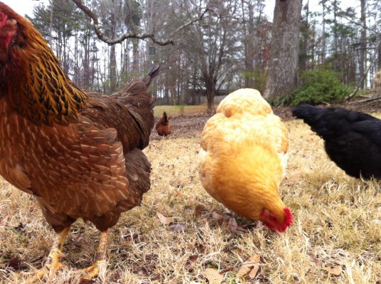
Graffiti and A Chicken

Filed under: Illustration | February 12, 2013

Chicken Scratch by Shanda McCloskey

Let’s face it, I’m a Georgia Peach. I like seeing trees, baby cows, and stars. I LOVE seeing the stars! But anyone who knows me well knows that a part of my heart belongs to Brooklyn, New York. I lived there with my husband and dog for a short year. What I miss the most is being in close proximity to other artists at every moment of every day. You breath it in. You eat it. You live it. Art seeps in.

I grew an admiration for graffiti there (especially in SoHo). It was more beautiful, skilled, and humorous than anything I’d seen in Atlanta. I thought about who those artists were. When did they create these masterpieces so no one would see them doing it? How did they get up there? Did they live these intense underground artist lives? Or were they just normal like me, and secret about it?

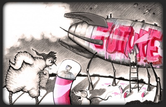
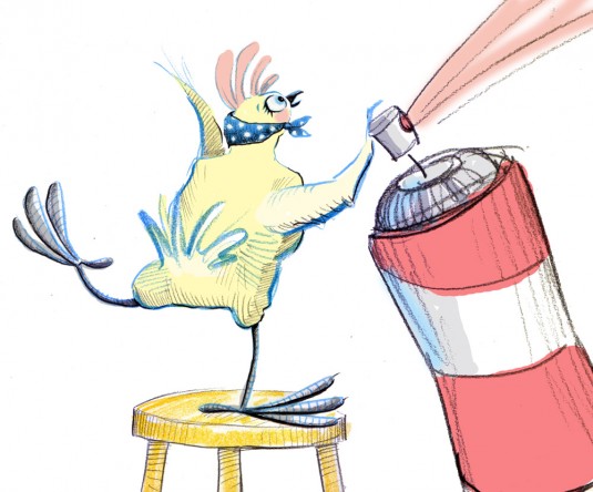
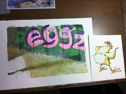
With that being said, its easy to see why I had the urge to illustrate a chicken writing graffiti, right? A clashing of my worlds :) I even wrote a story with this idea. It’s a work-in-progress still. But I wanted to share this illustration with you, because I think I’m headed in a decent direction with it. I would do several things differently on the next one, but I learned a lot from this. Here are my thoughts through it’s development…


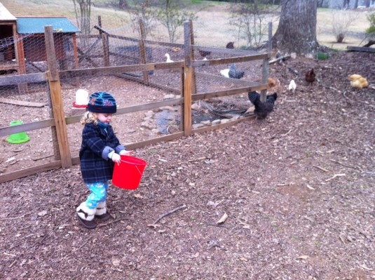
HJ feeding our neighbor's chickens.


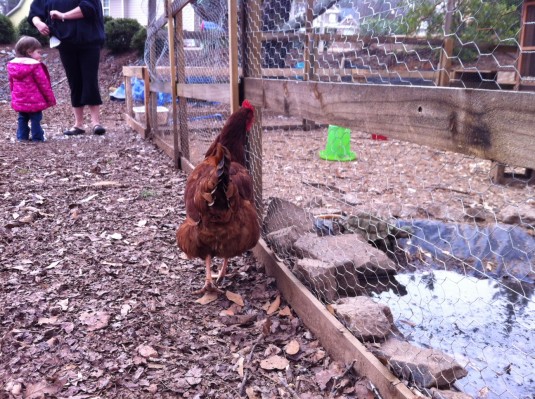
Every illustration starts off with a little research and play!


Brandie's Chickens

Lily and Chicken


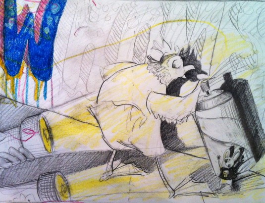
Then I sketch out my ideas. I did several before I finally decided on this sort of composition. I liked the trapped/caught moment and how it lets the graffiti play a large part of the picture.

Chicken Scratch Sketch


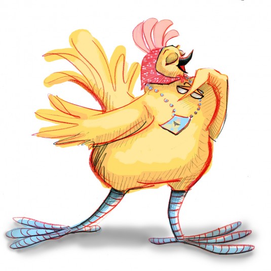
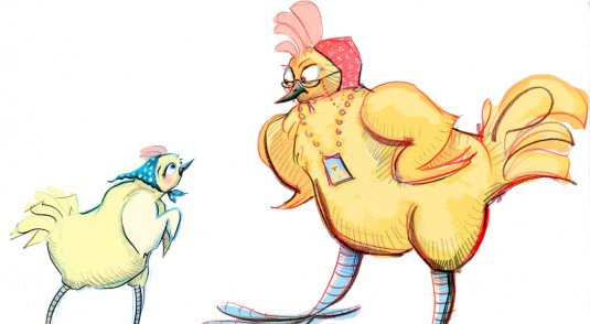
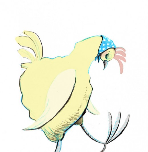
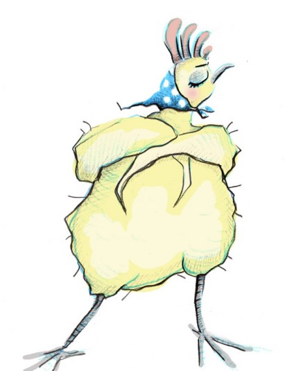
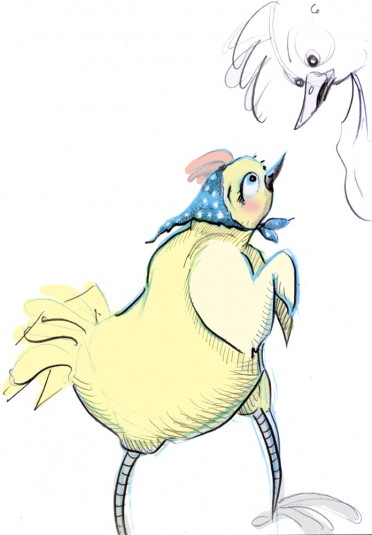
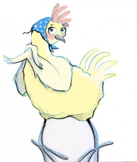
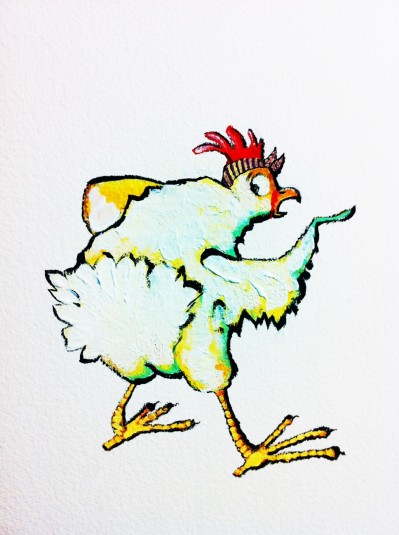
I had a work day and just wanted to work on the chicken character by itself. Here is my first draft. This chicken looks like a boy, and I didn’t like that. I wanted her to have a little artsy personality, so I added the bandana. All my chickens rock them.

1st chicken


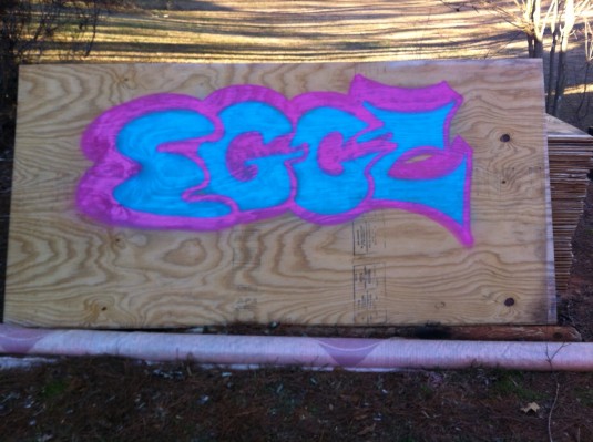
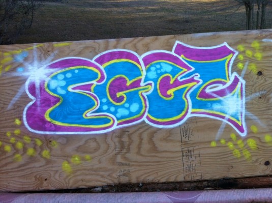
Then I did a lot of web research on writing graffiti. I learned about throw-up (quick bubble lettering), block buster (blocky lettering), and wild style (almost illegible/abstract lettering), and the best paint to use. I found Montana Gold spray paint easily at Dick Blick. It was pricey! But SO good. I tried my own (totally legal) below…

graffiti 1

graffiti 2


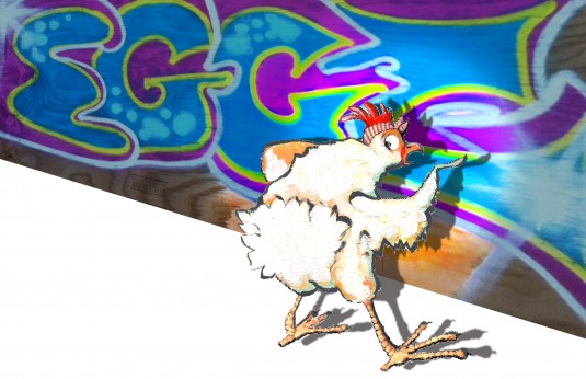
So then I took a photo and tried to combine this and my chicken character. The result was un-unified. They just didn’t mesh together (probably because I lack many Photoshop skills), and it also didn’t feel kid friendly to me…

draft of chicken and graffiti


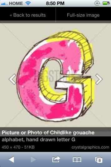
I researched and found some lettering that inspired me more on a kid level.

Google kid graffiti

Google kid graffiti 2


I looked at Loren Long’s “Otis” for how he used muted colors for the backgrounds and black outlines throughout. He is also painterly, which I tend to admire.

Otis by Loren Long


I painted a whole new background with brushes (instead of spray cans) for control.

new background


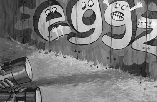
Too bright! So I took away the color and liked it better.

background black


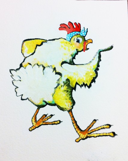
Then I worked on my chicken character again… Better, but still too bright. I like the primary color palette.

chicken character 2

muted chicken


Then I worked on piecing everything together digitally. I don’t care for that so much. I still feel that there is some disconnect in the picture (again, probably because I need to brush up on Photoshop skills). And lots of staring, thinking, tweaking, playing, changing, trying, undoing, muting colors…

desk 1

desk 2


And finally… Voila!

Chicken Scratch by Shanda McCloskey


Hope you enjoyed this post- the good, the bad, and the ugly :) -Shanda


A Sketch from My Book and Notes from My Head

Filed under: Illustration,On My Mind,Sketchbook | January 15, 2013

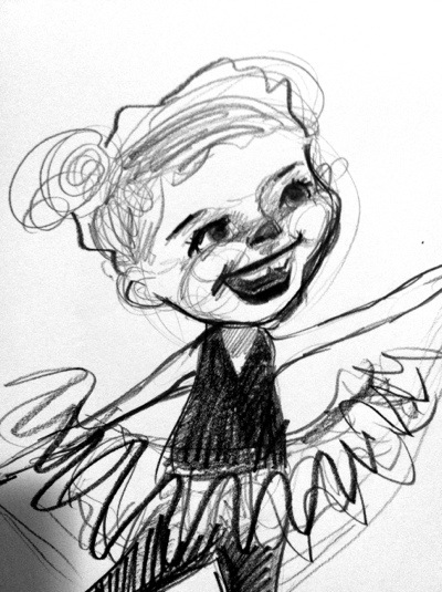
From my sketchbook.

My baby is my muse. Here’s some practice I did of her profile. Kids are so hard! Their faces are teeny and this ended up looking nothing like my particular kid… Maybe the overall shape might be close, but the face looks too old. Kids are tough to draw. But I really enjoyed charcoal pencils after a long time of not having any. My daughter added the abstract shapes and color around figure- she’s brilliant!

Well this is a good time to update you on what I’m currently working on. I’m proud that I have a manuscript written. It’s still too long and lacking something, so I’ve signed up for a formal manuscript critique at SCBWI Southern Breeze Spring Mingle (February 20-something). This should be interesting. It’s my first time doing this, so I’m just hoping I don’t get too discouraged by the feedback. I’m an artist who is wondering if she has a CHANCE of being able to write too. We’ll just have to see!

For Illustrator’s Day (which is now attached to Spring Mingle), I’ll be working on an illustration with guidance from Mark Braught. It’s sort-of a how you see yourself kind of assignment. Still thinking about this one, but I’ll try to show my progress as I go, like I did last year. Let’s hope it’s awesome enough to put on a postcard to send out to editors and art directors:) I’m really trying to figure out who I am as an illustrator. I feel like this year is going to be a very important year of my figuring some of that out… maybe :)

Well, that’s it for now! Have a great week.
-Shanda

Local Authors & Illustrators Excited to Visit Students!

Filed under: Illustration,SCBWI Southen Breeze | January 9, 2013


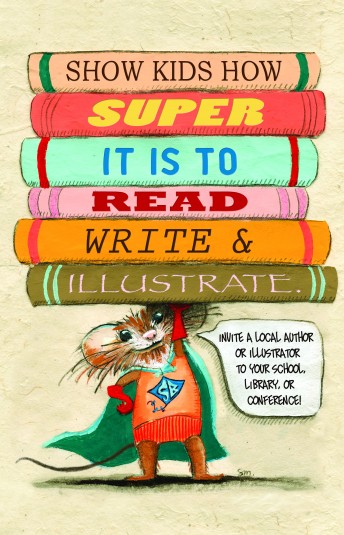
SCBWI Southern Breeze PAL Postcard front 2013 designed by Shanda McCloskey


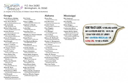
SCBWI Southern Breeze PAL Postcard back 2013


Hello! It’s a new year, and I was glad to have a project to do right away to get me warmed up to illustrating and writing in 2013! I’m excited for this new year, wondering what surprises (and hopefully lovely surprises) this year may have in store for me and my family. As I reflected on the past year, I am so very proud to be a part of the SCBWI community, my local SCBWI chapter: Southern Breeze, and my amazing, wonderful, how did I ever live without, local critique group of 7 incredibly creative folks!

So when I was asked by Southern Breeze to create a postcard for the published (PAL) members of our chapter I of course said yes! A chance to give back to one of the coolest things I’ve ever been a part of!

This postcard is for sending and handing out to schools and libraries in Alabama, Georgia, and Mississippi. Basically, it’s a quick list of the published authors and illustrators living locally that are available to come speak to kids about reading, writing, and illustrating books. This list includes picture book authors/illustrators, middle grade authors/illustrators, and young adult novelists. And not ALL of them out there are on this postcard. More can be found at SCBWI.org then click on Find A SpeakerIf you are a teacher, media specialist, or parent, please consider organizing a visit from a local published author or illustrator. I would have really benefited from a visit like this when I was in school. For most of my life, I assumed successful illustrators only lived in New York City or something – but that is NOT the case!

Until asked to design this postcard I didn’t realize Southern Breeze produced a promotion like this to reach out to schools and libraries. I think it’s amazing, and it just impressed me that much more!

Happy New Year, y’all! May it be filled with creativity and joy!

-Shanda
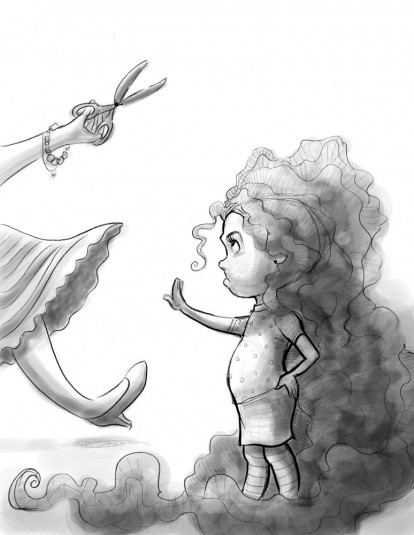
P.S.) After I created this postcard and sent it in, I realized that the young illustration may not be the best type of image to encompass all the different children’s genres. It’s okay for picture book folks and decent for some young middle grade/early chapter bookers, but I might have missed the boat on representing books for older children. And for that, I apologize. No one said anything to me to make me think this. It’s an observation of my own. Hey, I’m still learning :) If asked to do this project another year, I will definitely approach it with a more all-encompassing image. I DO hope I get to asked to do more stuff like this. I really enjoyed it!

A Tree… Always reaching. Always changing colors!

Filed under: Illustration,On My Mind | November 16, 2012
20121116-005758.jpg

Okay, so I’m trying to fit in an Illustration Friday sketch. The theme is tree. I know. It’s a stretch. But then again, not so much- I tried something new tonight. I’m reaching a little further into my artistic unknown. It might work out. It might not. Bare with me :)

I was admiring the work of LeUyen Pham tonight. I just checked out “Vamperina Ballerina” from the library. She’s amazing. I love how her characters have this retro-ness to them. Does anyone else see that? It’s marvelous. So I was inspired to play around with my own ballet character. She looks a little caricature-ish, but not as much as the first 10 I tried. I just need to work with her some more, but I wonder if this kind of stylistic character could ever be a part of my art? Maybe. I’m going to have to flow with the wind on this one, work with her some more and follow my branches, and see what the season has in store for me!

Happy Fall Y’all! (had to say it :)

« Newer PostsOlder Posts »

Shanda McCloskey, Children's Illustrator & Author