
Let’s face it, I’m a Georgia Peach. I like seeing trees, baby cows, and stars. I LOVE seeing the stars! But anyone who knows me well knows that a part of my heart belongs to Brooklyn, New York. I lived there with my husband and dog for a short year. What I miss the most is being in close proximity to other artists at every moment of every day. You breath it in. You eat it. You live it. Art seeps in.
I grew an admiration for graffiti there (especially in SoHo). It was more beautiful, skilled, and humorous than anything I’d seen in Atlanta. I thought about who those artists were. When did they create these masterpieces so no one would see them doing it? How did they get up there? Did they live these intense underground artist lives? Or were they just normal like me, and secret about it?
With that being said, its easy to see why I had the urge to illustrate a chicken writing graffiti, right? A clashing of my worlds :) I even wrote a story with this idea. It’s a work-in-progress still. But I wanted to share this illustration with you, because I think I’m headed in a decent direction with it. I would do several things differently on the next one, but I learned a lot from this. Here are my thoughts through it’s development…
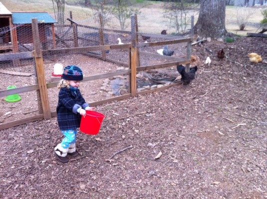
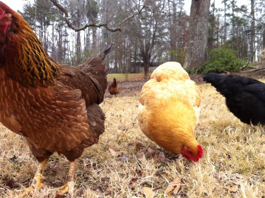
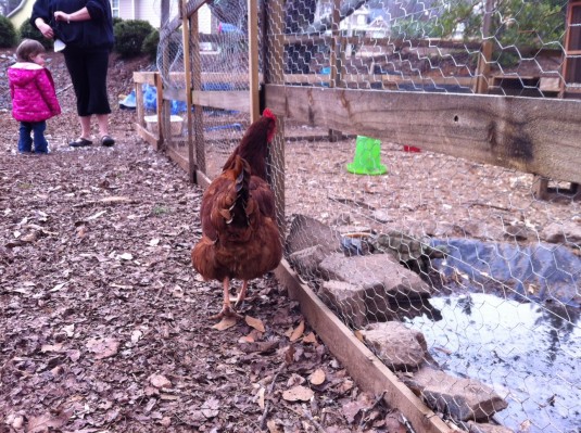
Every illustration starts off with a little research and play!
Then I sketch out my ideas. I did several before I finally decided on this sort of composition. I liked the trapped/caught moment and how it lets the graffiti play a large part of the picture.
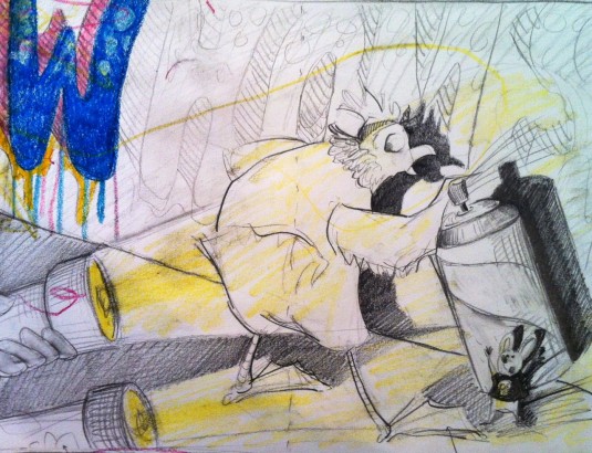
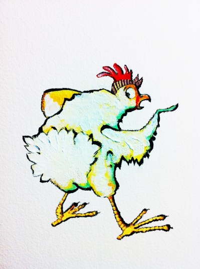
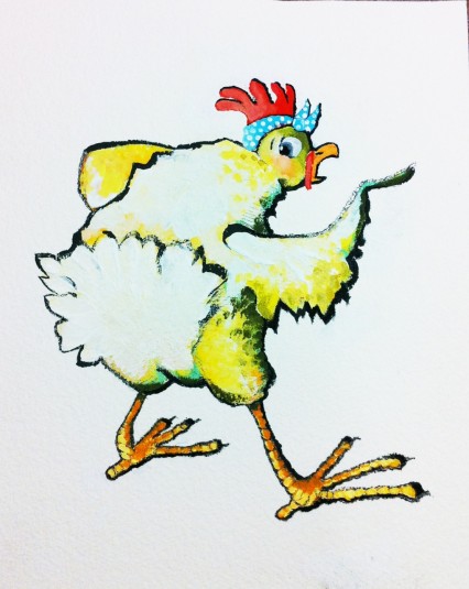
I had a work day and just wanted to work on the chicken character by itself. Here is my first draft. This chicken looks like a boy, and I didn’t like that. I wanted her to have a little artsy personality, so I added the bandana. All my chickens rock them.
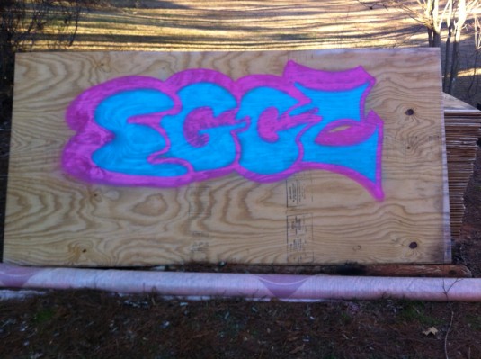
Then I did a lot of web research on writing graffiti. I learned about throw-up (quick bubble lettering), block buster (blocky lettering), and wild style (almost illegible/abstract lettering), and the best paint to use. I found Montana Gold spray paint easily at Dick Blick. It was pricey! But SO good. I tried my own (totally legal) below…
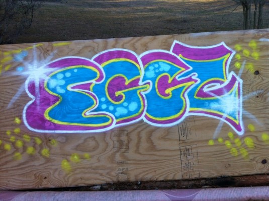
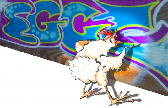
So then I took a photo and tried to combine this and my chicken character. The result was un-unified. They just didn’t mesh together (probably because I lack many Photoshop skills), and it also didn’t feel kid friendly to me…
I researched and found some lettering that inspired me more on a kid level.

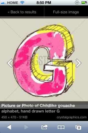
I looked at Loren Long’s “Otis” for how he used muted colors for the backgrounds and black outlines throughout. He is also painterly, which I tend to admire.

I painted a whole new background with brushes (instead of spray cans) for control.
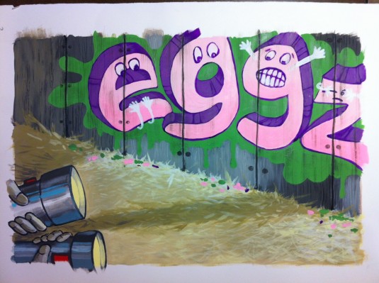
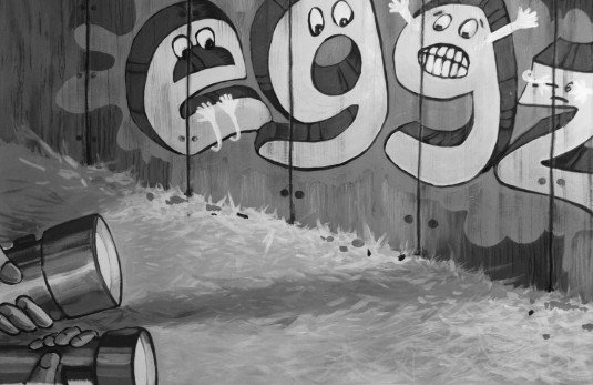
Too bright! So I took away the color and liked it better.
Then I worked on my chicken character again… Better, but still too bright. I like the primary color palette.

Then I worked on piecing everything together digitally. I don’t care for that so much. I still feel that there is some disconnect in the picture (again, probably because I need to brush up on Photoshop skills). And lots of staring, thinking, tweaking, playing, changing, trying, undoing, muting colors…
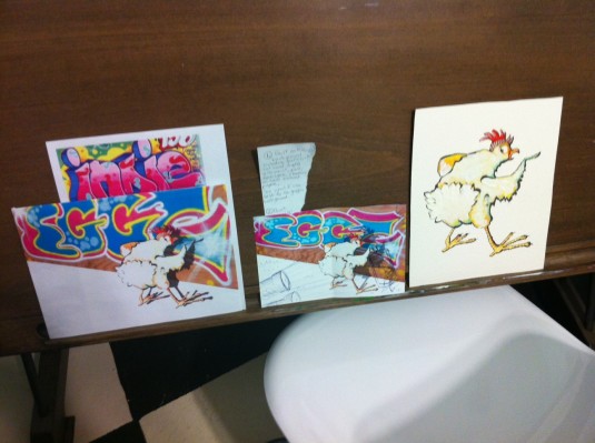
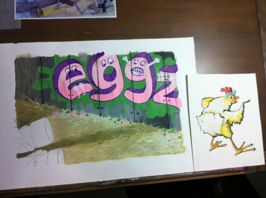
And finally… Voila!

Hope you enjoyed this post- the good, the bad, and the ugly :) -Shanda
Wow, Shanda! Love the entire production! Was a delight to read and view. Keep at it – looking forward to more Shanda-imaginings! :)
Comment by Nelda — February 12, 2013 @ 7:33 pmSHANDA, YOU HAVE SUCH A GOD GIVEN TALENT.PLEASE CONTINUE TO USE IT.
Comment by Peggy Jo Newton — February 12, 2013 @ 10:14 pmA-MAY-Zing, Shanda… love your process! I had no idea so much research goes into illustrations! I see good things for Chicken!
Comment by Kim — February 20, 2013 @ 12:41 pmLove the graffiti, it’s like a kid friendly Banksy!
Comment by Andrea M. — February 22, 2013 @ 5:14 pm